
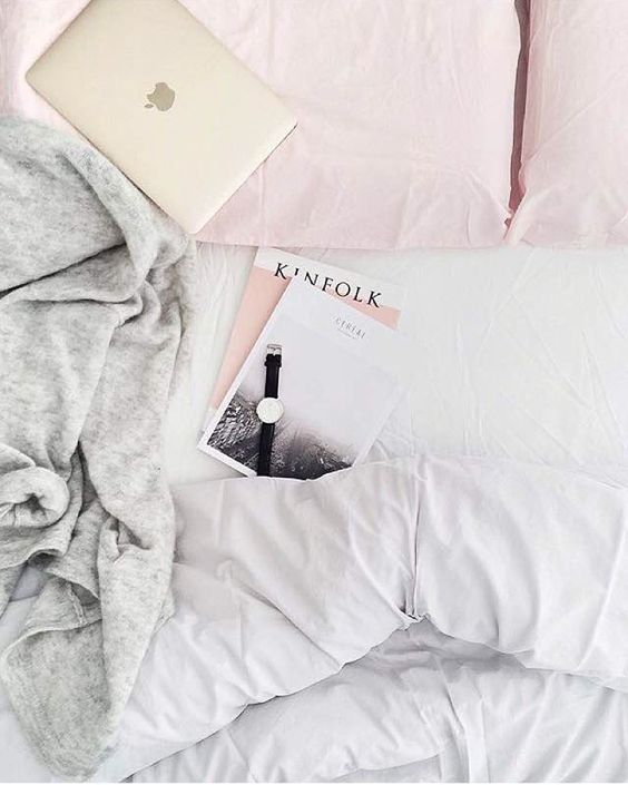
Today I want to share with you my favorite tips on how to create the perfect flatlay. It not’s about throwing all your stuff on the floor and taking a picture of it – you have to care about geometry, colors and shape and the right accessories.
FOLLOW THESE 4 SIMPLE RULES TO TAKE A PERFECT FLATLAY PICTURE
1. MATCHING COLORS
It’s important not to mix too many colors, but the right ones. You could make a monochromatic flatlay with just black and white or with a pop of color. I always like to use colors from the same family, e.g. rose and beige tones together.
2. GEOMETRY IS KEY
Sometimes it looks quite cool and edgy if your flatlay looks like you’ve just thrown all your stuff on the floor and took a picture of it. But most of the time I like to go for straight lines, rectangle shapes and not too much chaos.
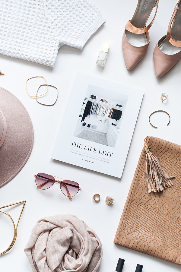
3. LEAVE SOME WHITESPACE
That’s really important, because nobody wants to search for items under all that crowded stuff on your picture. Keep it simple and clean! Leave enough white space (or whatever color you are using as a base) to make the pieces on your flatlay stand out.
4. USE THE RIGHT ACCESSORIES
You want to highlight one special product or item? Then use some accessories to make it look embedded in a nice and matching environment. I like to use beauty products like nailpolishes, lipsticks or eye shadows, jewellry or fashion accessories.

Leave a Reply